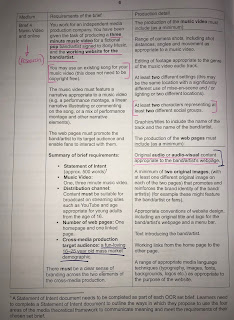
Designing a website for my fictional artist is an important step as a website can play a key part to an artists or bands brand image, reputation, aesthetic and audience reach. A successful website, like both Hozier's and Tom Odell's which I looked at in my case studies, will help a musical artist reach a wider audience and create more interaction between themselves and the listener. This overall can lead to more sales and profit in a real-life situation.
I have taken inspiration from both the case studies I conducted, notably taking the inspiration from Hozier to have video, visual content as you open the home page which I found instantly intriguing and linked so well to his latest album. It important I theme the website towards Henry's aesthetic, the same way both my case study pieces matched the website specifically to the artists image. Henry's image is retro, edgy and very based on the 'rock-star' style.
On my website I want to have the following features:
- An album/EP cover clearly on the home page
- A looped, audio-less video which will tie in particularly well to the theme of the website as well as the music video I have created
- A feature to play the song 'pink lemonade' when clicked (link to song stream)
- Extra album art featured
- Tour dates
- Instagram connection
- Merchandising page
- A short Bio about (inspired by Tom Odell's 'discover Jubilee road' feature)
- Links to 'Henry's' social media clearly displayed to promote interactivity between artist and audience. In the modern digital age, it is so much easier for artists to promote themselves using social media as audiences will feel more closely connected by having this access to pictures and information which draws them in to admiring an artist. This systematic chain leading from interactivity and audience reaction (Gauntlett) results in more sales or promoting messages which can be the two main purposes proposed by artists.
I want to make the website's colour theme dark and contrast this with bright bubblegum pink and blue, which are the two colours I found most associated with the 50's and 60's which is what his image is inspired from and the music video for 'pink lemonade' is entirely themed around.
However, I'm contrasting this with the album cover and album art which will feature Henry styled in 60's fashion yet will be edited in a modern, pop art way. This is a nod to the concept of 'postmodernism' plus society's new obsession for the old/vintage and how although different iconic memorabilia and fashion is retuning, it is adapted and modernised (especially in a technological sense).
This first image is the EP album cover I designed using a picture taken from the day which we filmed the scenes shot at the beach. I edited it at first to look very bubble-gum blue but felt that taking a more postmodern and interesting twist on the image was suitable, aesthetically pleasing and would fit the target demographic this would have to appeal towards.
This second image was also taken at the beach as the EP I decided at this point would be themed around the beach, a place lots of popular indie artists will film music videos and take pictures for album art (for example: Of monsters and men and Bombay bicycle club). I used an effect to make the image look as though Henry was followed by two shadows. This type of editing is quite surrealist which contrasts the entire theme of the music video which is that of realism and natural relationships and emotions.


No comments:
Post a Comment