Monday, September 30, 2019

DEVELOPMENT - 'MERCHANDISE'


 MERCHANDISE PAGE

 I created a page so that Henry could sell his merchandising to fans who can access the website. The merchandise has its own 'page' and consists of two Vinyls, A vinyl player, a unisex shirt and two posters.

Merchandising can help an artist generate more revenue as well as show off their 'brand' as people will wear or show off their merchandise, encouraging people to also take interest in the band or artist therefore.

When I was brainstorming the types of items I thought my fictional artist would likely advertise for consumers - my main focus was creating a vinyl and vinyl record player. This is because old fashion records fit the theme behind 'Pink Lemonade' suitably as they are retro, nostalgic forms of listening to music. However, in recent years vinyl sales have shown a '128% increase', slowly emerging as one of the most used forms of music consumption. This movement came hand in hand with the resurgence of 80's pop culture and of vintage fashion which proved audiences and consumers had a thirst for all things 'nostalgia'. Therefore, to emphasise Henrys rockstar persona, the nostalgic themes in the music video and also appeal to the 'mass, fun-loving'  audience I created both this customised vinyl player and record to sell.


This bowling shirt is another product advertised on the merchandise page. It is unisex which makes in convenient for production as well as encourages more inclusivity.

The 'Pink Lemonade' across the chest promotes the success of the EP and acts as more advertisement.

The icons on the bottom right of the shirt are reminiscent of the 'vibrant' bubblegum themes of the music video and includes a lemon wedge and glass of lemonade  to also represent the title of the EP.


I also designed two posters using images from my fictional artists web page. Posters are highly demanded by indie-pop fans as they like to decorate their living space with them. The target demographic is fairly young and so will still take an interest to hanging their idols around them.


This is how the merchandising page looks on a regular computer - the Prices are buttons which consumers can press with the notion it would take them to the online shopping checkout as on many other famous artists merchandising pages. 

'HENRY' remains across  the top of every page as a banner to further remind audiences of the overall 'brand' image he represents.

The background of the page is a moving video of the sea. This is intertextual to the music video for 'Pink Lemonade' as well as keeps in theme to the rest of the website as it is dark.

The description of the vinyl player is that it is 'sold out'. This was to make the page more realistic.


DEVELOPMENT - 'TOUR'

Tour dates / Henry Live

Performing is often a key element to an artist or a band becoming noticed by audiences, creating a fan-base who will buy or stream their music. A popular band or artist, such as Hozier or Coldplay, can often sell out huge concert venues to hundreds of people. This is not only a good way to gain revenue, but also is a way to connect with the audience on a more personal basis than through streaming music, which creates a stronger legion of fans. This is important for an artist so they can keep making music and profiting. 

I have taken inspiration from similar, indie pop musicians and constructed for my artist Henry a tour page which will include the dates for his fictional tour titled 'The bitter squeeze tour". The name is inspired by 'Pink lemonade' which the tour is based around. I thought 'bitter squeeze' was a fun name for a tour centred on the idea of lemonade.

This is how the link to the page looks on the home page when the audience scrolls down. The person visiting the website can click 'more dates' to be taken specifically to 'The bitter squeeze tour' page.


This is the page specifically for the tour dates which includes: Moterpoint Arena in Nottingham, The Cavern club in Liverpool, The Eden project in Cornwall, Concorde 2 in Brighton and Reading festival 2020. The page is in keeping with the home pages theme but i've added an animated record which spins as you open the page - I think this is a good feature to add to the wesbite as it links with Henrys merchandise (primarly retro themed items), the retro brand image and is engaging to the visitor to the page.


If you select the little arrow on any of the tour dates it will give more information regarding the date. including the date and time. This makes the web page feel more realistic.

Monday, September 23, 2019

PRODUCTION - SECOND EDIT


This was my second official edit of the music video after I took into consideration my focus to include more of Henry. I fluidly managed to cut these shots into what I had already created. I found this overall was better flowing upon playback and made more sense to the narrative.

Wednesday, September 11, 2019

PLANNING - WEBSITE THEME IDEAS

WEBSITE THEME IDEAS

Designing a website for my fictional artist is an important step as a website can play a key part to an artists or bands brand image, reputation, aesthetic and audience reach. A successful website, like both Hozier's and Tom Odell's which I looked at in my case studies, will help a musical artist reach a wider audience and create more interaction between themselves and the listener. This overall can lead to more sales and profit in a real-life situation.

I have taken inspiration from both the case studies I conducted, notably taking the inspiration from Hozier to have  video, visual content as you open the home page which I found instantly intriguing and linked so well to his latest album. It important I theme the website towards Henry's aesthetic, the same way both my case study pieces matched the website specifically to the artists image. Henry's image is retro, edgy and very based on the 'rock-star' style.


On my website I want to have the following features:
  • An album/EP cover clearly on the home page
  • A looped, audio-less video which will tie in particularly well to the theme of the website as well as the music video I have created
  • A feature to play the song 'pink lemonade' when clicked (link to song stream)
  • Extra album art featured
  • Tour dates
  • Instagram connection
  • Merchandising  page
  •  A short Bio about (inspired by Tom Odell's 'discover Jubilee road' feature)
  •  Links to 'Henry's' social media clearly displayed to promote interactivity between artist and audience. In the modern digital age, it is so much easier for artists to promote themselves using social media as audiences will feel more closely connected by having this access to pictures and information which draws them in to admiring an artist. This systematic chain leading from interactivity and audience reaction (Gauntlett) results in more sales or promoting messages which can be the two main purposes proposed by artists.
I want to make the website's colour theme dark and contrast this with bright bubblegum pink and blue, which are the two colours I found most associated with the 50's and 60's which is what his image is inspired from and the music video for  'pink lemonade' is entirely themed around.
However, I'm contrasting this with the album cover and album art which will feature Henry styled in 60's fashion yet will be edited in a modern, pop art way. This is a nod to the concept of 'postmodernism' plus society's new obsession for the old/vintage and how although different iconic memorabilia and fashion is retuning, it is adapted and modernised (especially in a technological sense). 


This first image is the EP album cover I designed using a picture taken from the day which we filmed the scenes shot at the beach. I edited it at first to look very bubble-gum blue but felt that taking a more postmodern and interesting twist on the image was suitable, aesthetically pleasing and would fit the target demographic this would have to appeal towards.


This second image was also taken at the beach as the EP I decided at this point would be themed around the beach, a place lots of popular indie artists will film music videos and take pictures for album art (for example: Of monsters and men and Bombay bicycle club). I used an effect to make the image look as though Henry was followed by two shadows. This type of editing is quite surrealist which contrasts the entire theme of the music video which is that of realism and natural relationships and emotions.

Tuesday, September 10, 2019

PRODUCTION - FIRST EDIT


This was the First Draft of my music video. I felt for my first attempt, that this was a good attempt as I completed a lot of the beginning parts of the video I had aimed to. I started using iMovie to edit, but swiftly transitioned to use Adobe Premier pro which I found easier to use for a number of reasons including the factor I could pull videos into sections without having the need to have video before it, I found it could stand alone which was very beneficial and convenient. I liked this software as I found I could easily edit the visual aspect to each video down to a very fine detail, allowing me to lighten the darker videos so that each fitted and ran smoothly. I put a heavy pink filter on each 'verse' to create contrast to the blue hue on the Diner section.

Upon reflection I realised I wanted to put more of a focus on Henry during the verses - so I aimed to re-edit this next time using shots of Henry lip-singing the song to create more focus on his 'star' appeal.


PRODUCTION - FEEDBACK ON SHOOTING

I shot my music video over a series of three days separately shooting The diner scenes used for the chorus of my song as well as those shot in the dark location with neon lights, The beach and forest scenes used for two verses and The scenes shot at Southend-on-sea arcades and pier. I was very fortunate each day that my actors could travel to location and dedicate the full day or evening to work on taking multiple shots. I began with a shot list which i followed through on each day in order to have 3 angles of each shot, giving me flexibility when it came to the editing stage.

Diner & dark room shoot


GOOD POINTS OF SHOOT
  • Location - i was fortunate to be allowed to use the Diner flexibly for my shoot
  • Relationship between The actors was strong and they were willing to follow order
  • Relaxed environment meant better shots of the actors, especially the shots of henry lip-lipsynching and smiling. 

BAD POINTS OF SHOOT

  • The Diner wasn't very busy so less natural atmosphere 
  • Lighting was difficult as we had to work with where was natural 

Beach and Forest shoot


GOOD POINTS OF SHOOT
  • Weather was warm and sunny and helped make the videos taken look more golden
  • Henry and Emily had a great working relationship throughout the shoot
  • Accessible location
BAD POINTS OF SHOOT
  • There were people wondering around the forest which made it hard to shoot as dogs kept walking in on the shoot 
  • Timing was hard as we only had a certain amount of natural lighting left as we shot during the afternoon/evening.
Pier and Arcades shoot


GOOD POINTS OF SHOOT

  • Weather
  •  relationship together
  •  Iconic-ness of location


BAD POINTS OF SHOOT

  • 'busy-ness' of Southend made it difficult to shoot without the general public getting into shot 
  •  Restrictions on where we could film - We were not allowed inside the arcades


Friday, September 6, 2019

PRODUCTION - USING THE SOFTWARE


EDITING

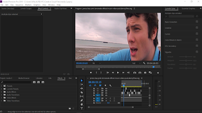
Throughout the editing process, I used Adobe Premier pro to construct my music video. I found this a great software to use as it was very easy to match up the lip-synching with the song itself. This was helpful to make the piece flow better when played through. Adobe allowed me to place different videos in specific places - I began editing the verses first, leaving the chorus till last.

I enjoyed working with adobe as it had a huge variety of ways to edit the overall image. I filtered each video to be more saturated (to make the intertextuality between 'supersoaker' clearer). I also edited the verses to have a heavy pink filter and the diner scenes to have a heavy blue filter. With adobe, this was easy and sleek.


Tuesday, September 3, 2019

GENERIC RESEARCH - ARTIST WEBSITE CASE STUDY - TOM ODELL


TOM ODELL
https://www.tomodell.com/

Tom Odell is a suitable case study candidate as he is a similar artist to my own fictional artist 'Henry'. Although he is part of the 'Indie' music movement, he has had multiple singles in the top charts, appealing to the mass markets to even be victorious of a number Ten space on the top 40.

The official website for Tom Odell is themed around his latest album 'Jubilee Road', focusing an interactive section around the street and allowing visitors to the page and fans to 'explore' this.
The website has a strong sense of branding and focus on the artist himself as the heading rotates pictures which he is featured in. Alongside this, the webpage has links to the following sections: 'Explore','Music','Videos','Live', 'Gallery' and 'official store'. These links allow fans to navigate to where they can buy items of official merchandise, look at pictures from gigs and find out tour dates. 'Music' directly connects fans to a streaming service as well.

The 'Explore' feature is what i find most interesting and interactive as fans can 'meet friends and neighbours' as well as explore the house itself features in the animated photo that is displayed on the webpage. This brings a new level of interactivity between Odell and his Fans as they can find out more about the concept of his music and where it has come from, creating a bigger connection therefore to him and his music. I wish to create a similar feature with my own website for Henry by including visual content which is engaging (similar to how the image on this web page feels as though it has been 'brought' to life) and giving the audience more information perhaps on the inspiration for the music video to make it altogether more personal.

Furthermore, The webpage for Odell clearly displays links to his social media, allowing him to appeal to the demographic of a mass market as they are likely to be part of the digital age and using social media to stay connected.


GENERIC RESEARCH - ARTIST WEBSITE CASE STUDY - HOZIER

HOZIER
https://hozier.com/

Hozier is another suitable candidate to act as a case study in comparison to my own fictional artist 'Henry' as he is partially an alternative style singer yet has appealed to the mass demographic with Multiple singles in the chart and He had his international breakthrough after releasing his debut single "Take Me to Church", which had been certified multi-platinum in several countries, including the US, the UK, and Canada.

The website for Hozier has a strong sense of 'branding' as the featured video played behind information on page navigation is taken from the 'Wasteland baby' Album artwork he has most recently released. The video is engaging as it shows Hozier underwater with repetition of this imagery across all the web links aside tour dates which features a strong, red filtered photo of Hozier performing at a gig.

The deep blue theme of the web pages links to the themes of his music and his Logo for his stage name 'Hozier' is boldly displayed at the heading of the webpage.

There is a sense of strong interactivity between the artist and Audience as there are clear links to his social media accounts at the heading of the page, this encourages more fans to stay up to date with news on Hozier and encourages more to listen to his music therefore. 

The page with merchandise displays the sale of vinyl records, which are old fashioned discs used for listening to music on vinyl players. In modern culture, The use of vinyl players has increased due to a resurgence in admiration for all things 'vintage'. Therefore, due to how I plan to portray my artist 'Henry' to be an old fashioned loving rockstar, i also will take inspiration from Hozier to offer 'Merch' on my own web page centred around vintage terms like vinyl records. 


BRIEF NUMBER 4

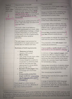
For my media project I have chosen to make a music video for a ‘fictional pop artist’ as well as the ‘artists’ working website. As part o...